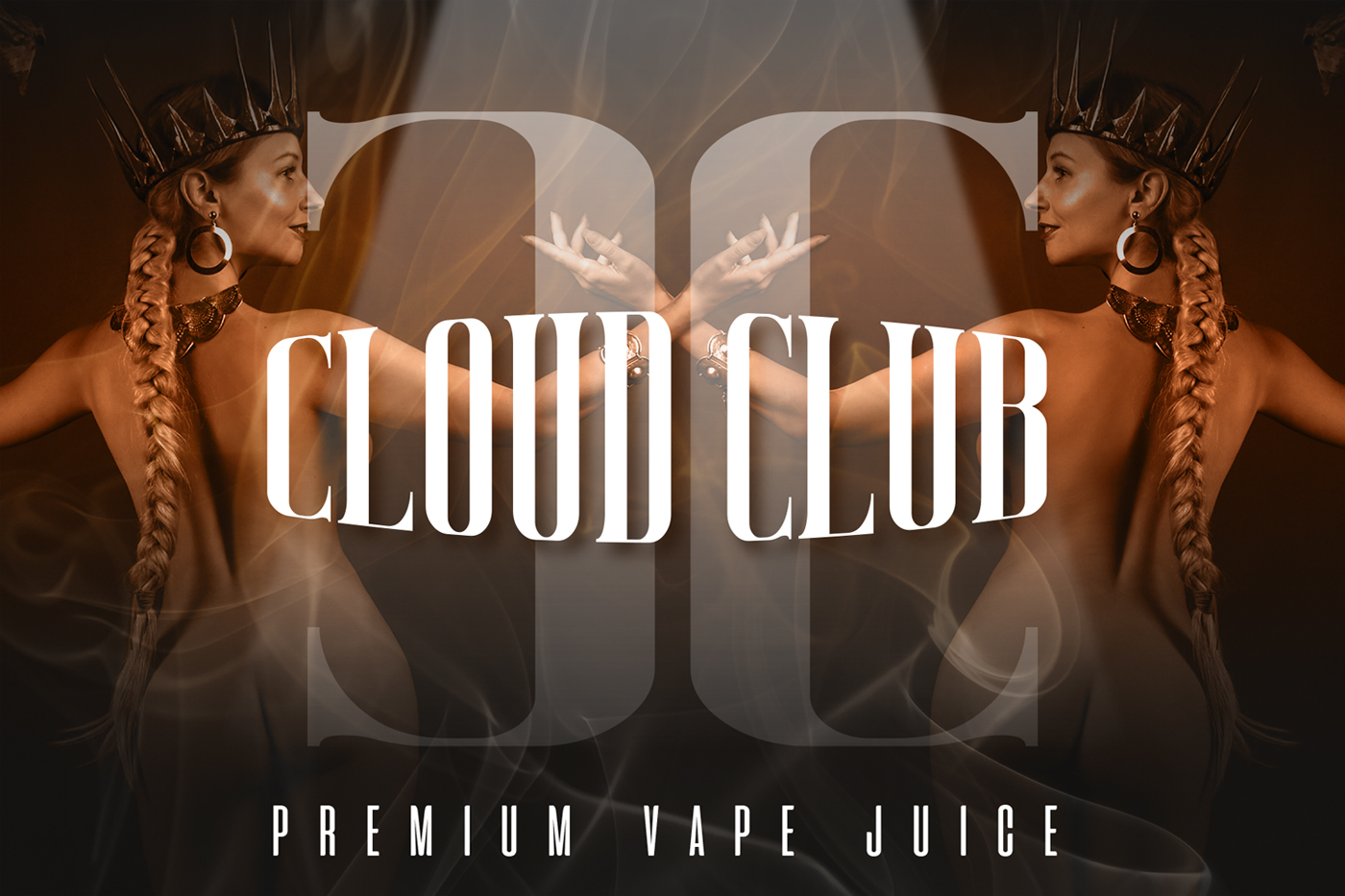
Cloud Club is the future of vaping and a healthier solution in comparison to other vape brands. We take pride in the quality of juices and the image we strive to maintain. For those hardcore gamers and streamers who vape while playing and the ordinary community that enjoy great tasting vape juice. Now you can vape to keep you relaxed in those high tension moments while gaming. It’s not just energy drinks anymore, but vaping great flavours while gaming.
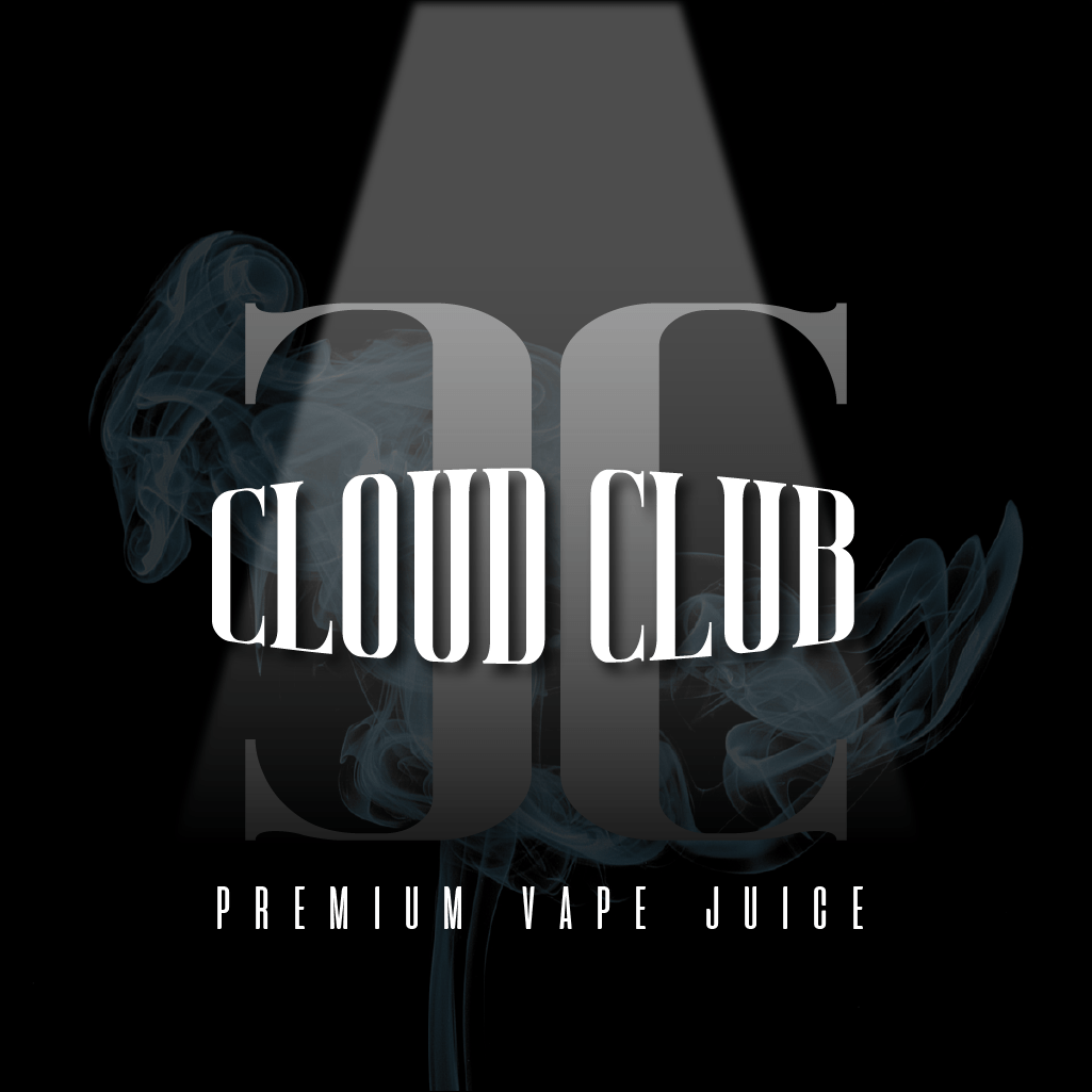
Cloud Club
Subject
timeline
2022 June – July
soft
Photoshop, Illustrator, Xd
Category
Logo
Task : To create a logo that represents a luxury brand and is also suitable for branding and packaging. The logo should be simple, easy to read and bold.
Result
Using initials can be a good approach for creating a bold and memorable logo, especially if the company name is long or difficult to pronounce.
Therefore I went with the initials and understood the audience would be 25-60+ year old professionals and being a premium brand also made me choose a more classic font that was bold and easy to read.


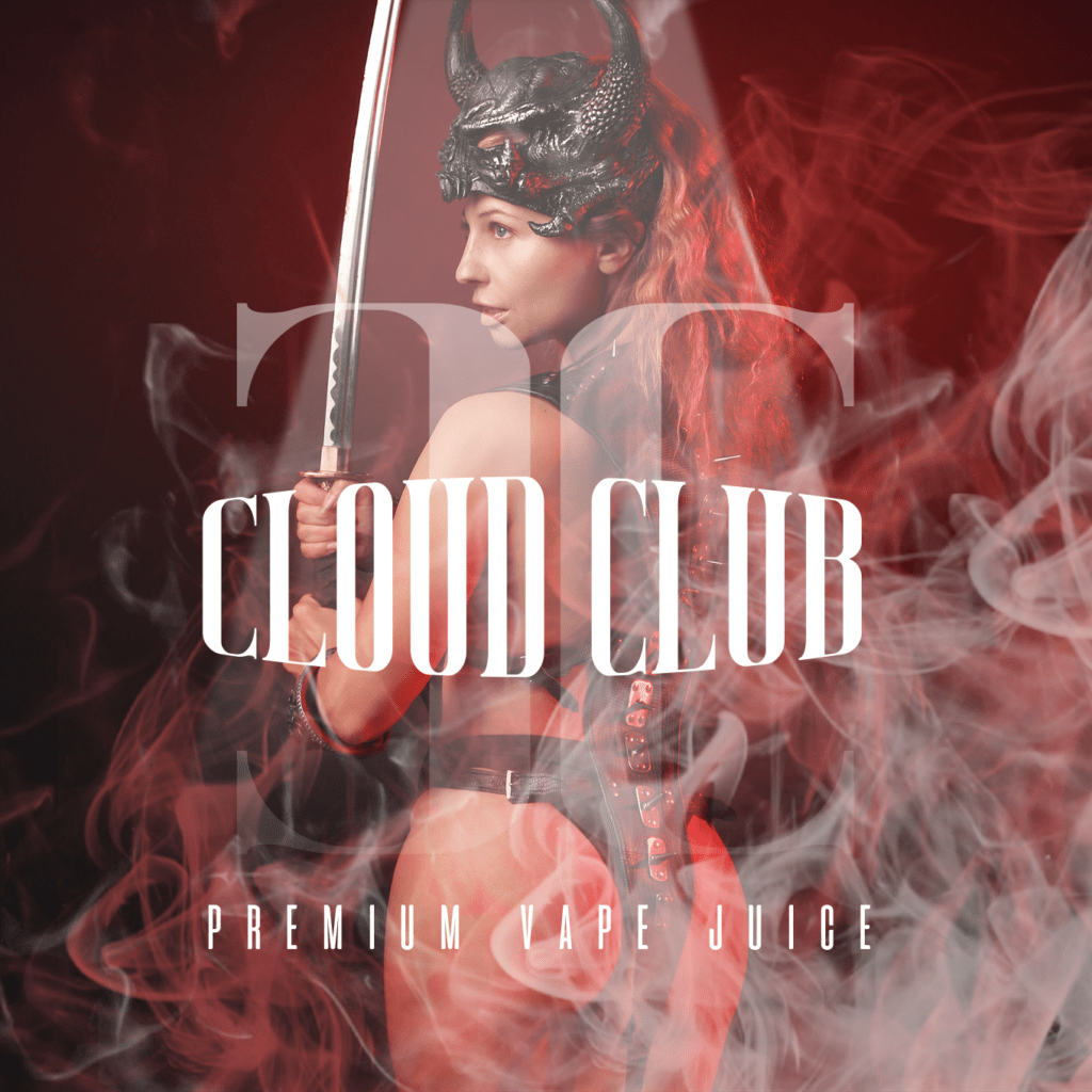
Branding
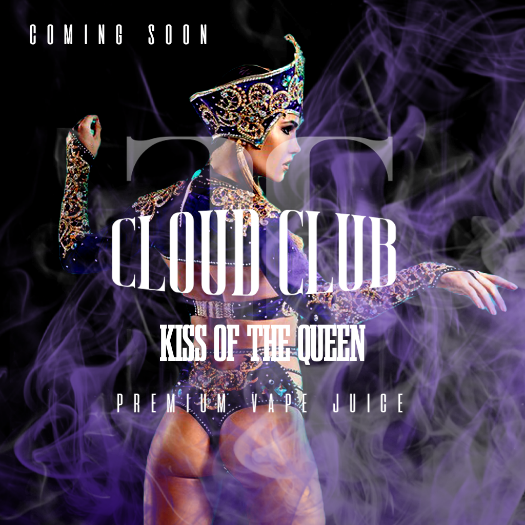
To develop a brand and recognisable packaging that would stand out against competitors on a shop wall. It should also be attractive to gamers for sponsored ads and social media. It should also implement a cosmo/anime theme.
Result
Developing a strong brand and recognisable packaging can be key to standing out against competitors and attracting customers. Here are a few points I considered when creating the brand and packaging:
- Defining the brand
- Researching competitors
- Packaging design
- Functionality
Below are the different packaging designs I have created for the flavours that were released.
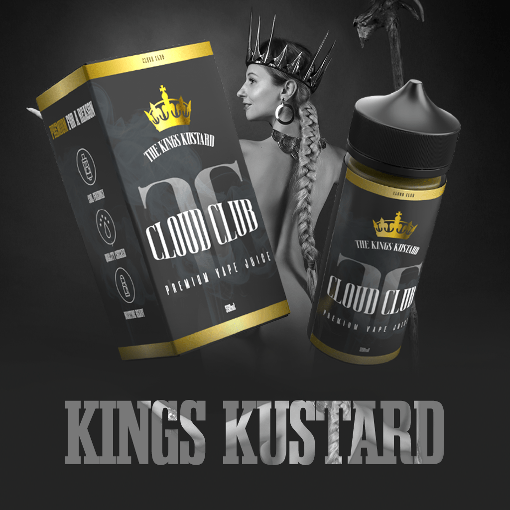
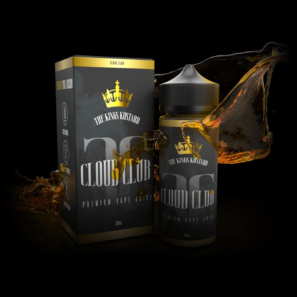
The Kings Kustard
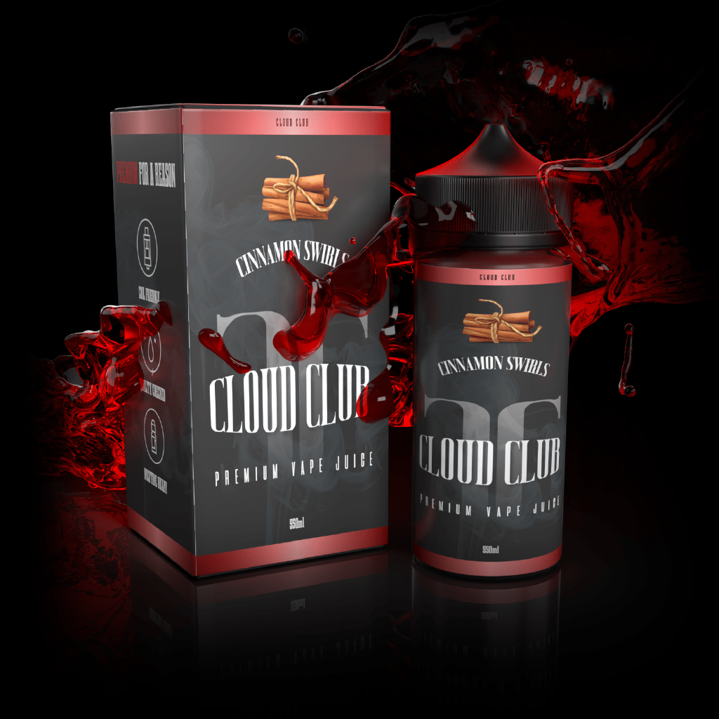
Cinnamon Swirls
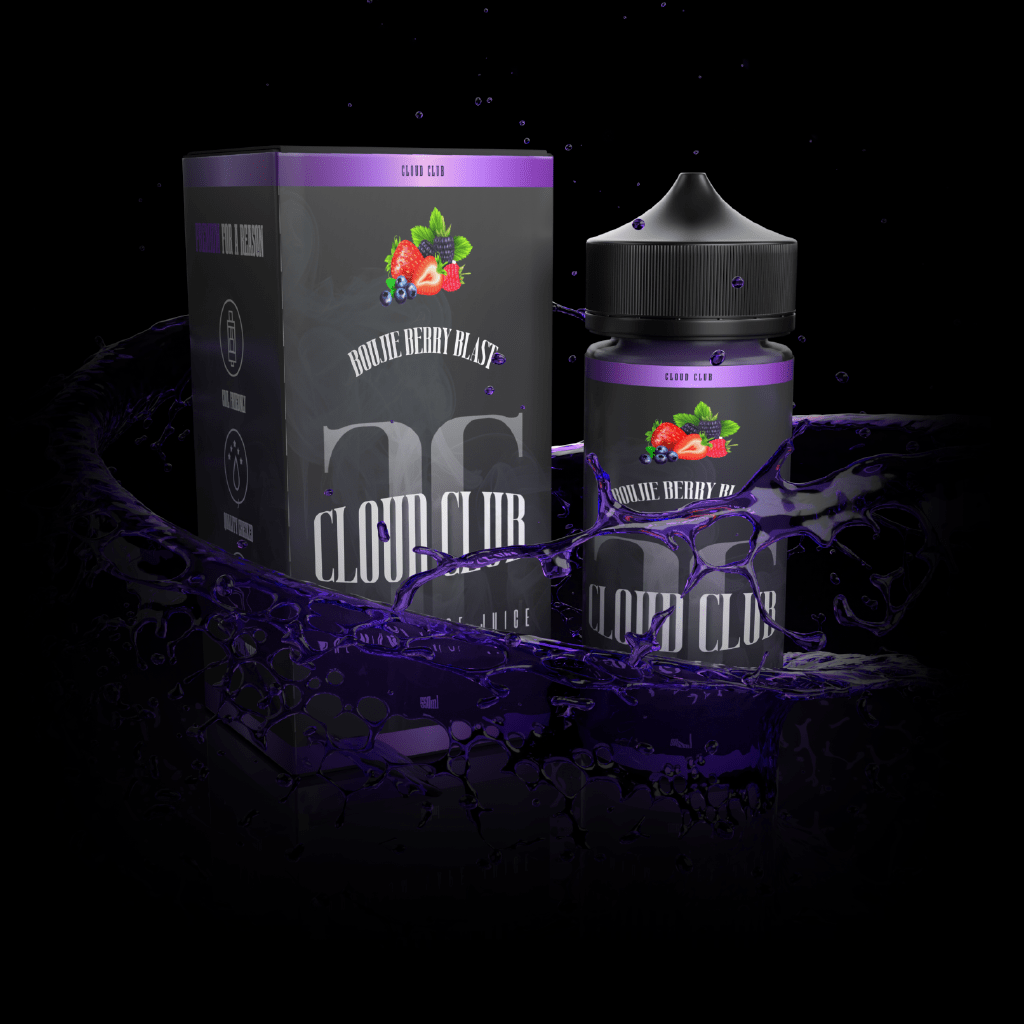
Boujie Berry Blast
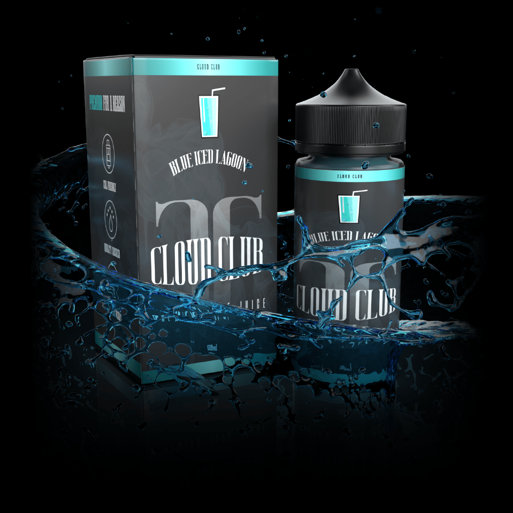
Blue Iced Lagoon
UI/UX
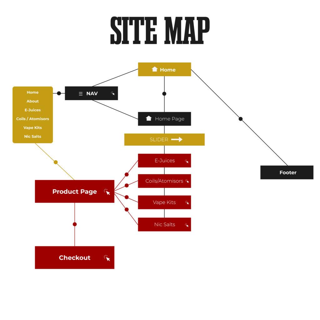
To develop a structure of a wireframe, first with a map of the website and then a prototyped version.
Result
I was very peculiar in this site, after researching and finding out that most vape sites had many pain points. For CloudClub customers, I wanted the experience to be different.
I reduced as many pain points possible and made it a simple click through flow, the reason being is because the target audience varies massively in age difference.

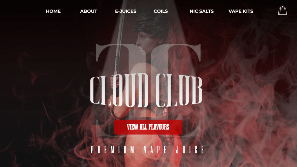
Website View
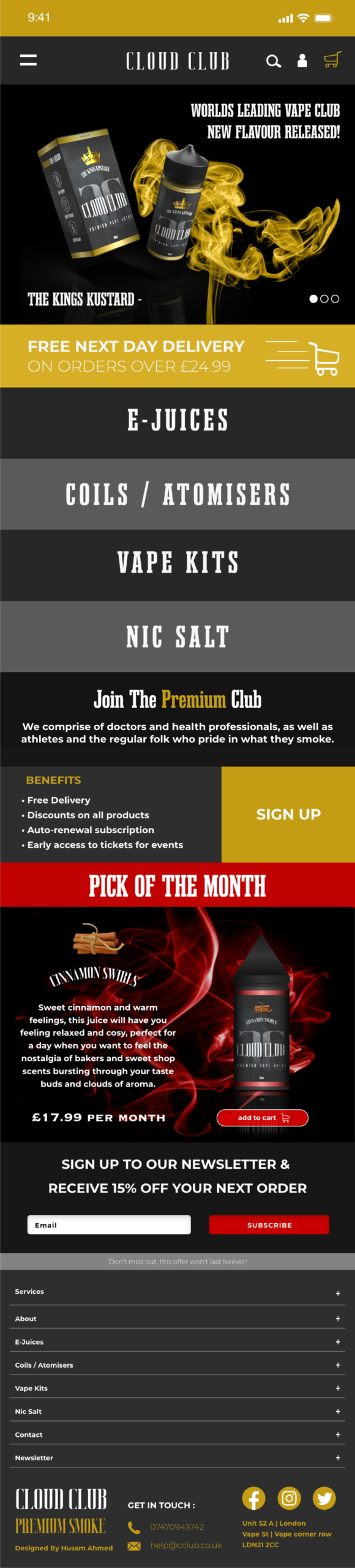
Mobile View
Functionality
The mobile site was carefully designed to be a simple scroll down site. This means, whatever a user is looking for, they are bound to come across it as they scroll down without needing to scroll back up.
This site also provides a menu in full screen when the user interacts with the hamburger icon. I designed it to be a full page drop down menu so that users can use one hand and interact with more than 70% of the site.
Design
The branding plays a strong part in the design of the site, making it instantly noticeable due to the vibrant contrasting colours and the style of imagery.
I have also placed the most biggest promotion at the top of the page to entice users to buy items without leaving the page, furthermore, adding a shop button once more additional info has been displayed.
Purpose
The purpose of the site is to ensure users can purchase items without much clicking, to get them straight to the checkout. As with most vape sites, there are a more than 4 pain points on average to the cart. In this wireframe all those pain points have been removed.